
Website Tips
Website Design Tips
People say that first impressions count - and these days you only have a few seconds to do that with a website before a potential visitor will decide whether to stay or leave.
Visitors typically make that decision anywhere between a fraction of a second to around 10 seconds from landing on a page, with the initial impression being crucial. First impressions are almost entirely design related.
Imagine that you are buying a house. You arrive and knock on the door. It opens and you step inside to be confronted with an entrance hall with pink walls and a bright orange carpet. Worse still, the living room has dark blue walls and a brown carpet with a green sofa. Your immediate instinct is to leave.
It's a brave person who can see past the headache inducing decor to decide whether the basic layout and construction of the house is suitable for their needs, or not. And so it is with a website. If it looks terrible, then most visitors will quickly leave, even if the content is actually useful.
Good Web Design Is Not Quick

A decent website design will take many hours, not the minutes that some DIY design packages would have you believe.
Bad Web Design Example
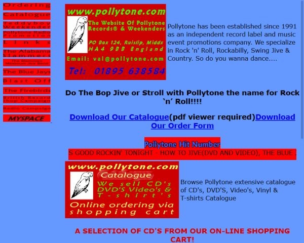
It's an old site, but no amount of modern technical wizardry could make up for simply terrible design and colour choices!
The Basics
A good website doesn't just need information; it needs to present that information in a clear and readable format. Here are some essential design fundamentals that need to be considered:
-
Fonts: The text size and style need to be clear and readable, especially if the site will be used by people who may have a visual impairment. Good line-spacing is also critical to avoid a dense, cramped appearance. Generally, heading text is larger and in a different font from the body text, but the heading font should complement the body font, not clash with it. So, for example, you wouldn't normally have an Old English style heading font with modern style body text.
-
Colours: Colour theory is complex and wide-ranging, but put simply, the choice of colours used will create the mood for the website. So don't choose vibrant clashing colours when you want to create a feeling of calm in the reader's mind. You may decide to use your corporate branding scheme, but as with room decor, there are also fashions in colour and colour combinations. Out of date schemes can make a website look dowdy. The text colour also needs to maintain sufficient contrast with the page background for good readability. For example, beware colour combinations that are difficult to read if you are colour-blind.
-
Layout: The flow of the text and images used needs to be clear and logical, both when viewed on a wider computer screen and in a column format on a mobile or tablet. Images should generally be relevant to the nearby text and add interest, especially when in column format on a smaller screen. Avoid using a layout which involves scrolling both up and down to follow the flow of content.
-
Effects: These are things like fades, slides and other transitions such as colour changes and content reveals. Many of these are dependent on hovering a mouse over the item in question. Too many of them, poorly done, are both annoying and distracting. Also, keep in mind that touchscreens have no mouse-hover equivalent and effects such as content reveals will simply not work and are therefore best avoided. The object is to enhance the content, not to show how clever you, or the design package you used, can be. Sometimes, less is more.
-
Content: This is listed last as it comes after all the previous items in determining a first impression - because it takes the longest to evaluate. However, it's actually really important as, after all, it's the fundamental reason why the visitor to your website is there. So, content should therefore be relevant and concise, with a clear logical flow and explanations. Images should be of high quality and visually appealing. The language used should be of a level aimed at the type of visitor you are trying to attract. For example; it is pointless offering a long-winded and complex explanation of a topic which is full of technical terms that are way above the level of understanding of your expected visitors.
Those are the top 5 items, but there are numerous other external factors to take into consideration when building a new website. Two of the most important are; how to attract visitors to the new site and then knowing what they do whilst they are there. Each of these is discussed below.
Search Engine Optimisation
Attracting visitors to your website can be done in a number of ways, such as advertising, being mentioned on other web sites and, most importantly, appearing high up in the results list of search engine queries. This means that you need to make the pages of your website "Search-Engine Friendly", so that when the search-engine web crawlers periodically scan your site, they like what they find.
Search Engine Optimisation (SEO) is a combination of skill and intuition to optimise a website to make it as relevant as possible to the algorithms (mathematical formulas) that search engines use to rank or order their search results. Crucial to this is making the optimum choice of words for the page Title, Keywords and Description fields, ensuring they also appear in the content text. It also helps if the page is mobile-friendly and the pages load quickly.
There are many other parameters used by search-engine algorithms to determine page ranking, but these are beyond the scope of this page.
Visitor Tracking
Once you have persuaded or at least attracted a visitor to come to the website, it helps greatly to know how they got there and what they did whilst they were there. For example; which pages they visited and in which order, how long they spent there, where they were and what device they were using. From this you can deduce such things as which pages are most and least popular, which device type most people use to view the site, whether they are predominantly local or from further away, which days and times have most visitors, plus many other details.
The best way to get this data is by using one of the visitor-tracking services available on the Internet. Most give you some special code and a unique ID to insert into the website pages and the service then uses this to keep a record of the website activity. Some also allow you to add additional custom parameters to track specific actions or settings. StatCounter is one of those and is the service used by all WebShell sites. Of course, this data is only useful if it is actually acted upon to improve the website.
Note: By default, WebShell sites only collect anonymised data. No user identifiable information is collected or transmitted. For an informational website, there is no need. Be aware also that some browsers actively block tracking services as a privacy issue and this may skew your results.
Summary
As you can hopefully see, there is a lot more to website design than just dragging-and-dropping some images and text onto a blank page in a DIY web design package. A good design takes time.
If you are technically minded and have the skills necessary to make a DIY design package work for you and you don't mind the bloated code that most produce, plus you have the time it takes to maintain and update the website you produce with it, then by all means go ahead.
But if you feel that you don't have the right combination of skills, time or knowledge to design, produce and maintain an efficient, fast-loading website, then we are here to help do it for you.