
System Overview
WebShell: The Flexible Site Framework
Our websites, including this one, are built using WebShell — a flexible, lightweight, responsive framework developed in-house to provide great looking informational website pages that work across all types of device from desktop PC's to smartphones.
Automatically adjusting the page layout to the device display, it presents the optimum viewing experience on differing screen sizes. Designed to be easily updateable, WebShell is compliant with modern web standards and is the ideal solution for sole-trader and small business websites. It's also completely portable and can be used with any webserver.
Best of all, when taken as part of our website packages, it's completely free!
Delitech Website
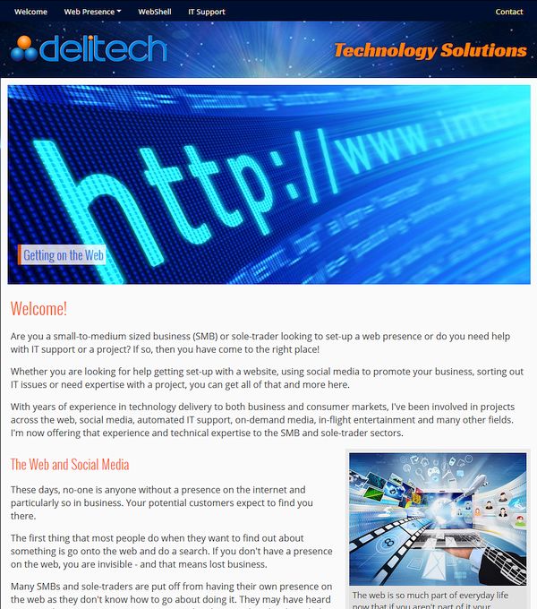
This website is itself built with WebShell as an example of what can be done. More examples are shown below.
Concept
Designing a website might sound easy and there are people (mostly the ones who will be trying to sell you their DIY web design tools) who will try to convince you that it is.
In fact, building a website that looks professional, works well on different screen sizes and looks the same in all of the major web browsers is a much more complicated task - and that is exactly what WebShell has been designed to achieve with minimum effort.
An in-house project, WebShell was developed to take care of display and page layout issues and more, allowing the website design effort to be concentrated on producing top quality content for your visitors.
Some Feature Highlights
On most websites, only the Content section tends to change between pages and so normally only this section is downloaded by WebShell when new pages are opened. This provides a much better visual experience and saves both time and data - especially important when websites are viewed on mobiles with set data allowances and variable quality connections.
WebShell comes with a host of features including a site preloader, image slide galleries, newsfeed, audio and video players, auto-balancing columns, enhanced page tracking and many other functions. It is also aware of Bank Holidays, Easter, Christmas and New Year periods and even when the clocks go forward and back.
This allows for such things as conditional content or page decoration to suit the time of year, all of which can be set to appear automatically. There is even a battery-saving 'dark-mode' option for mobiles with OLED displays or reduce screen glare in low-light conditions.
WebShell doesn't require any special server settings or add-ons, which means that you are not tied to one hosting provider and can easily move a site to almost any modern hosting service.
Some example sites are shown below:
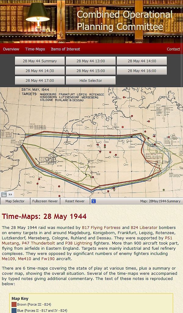
ISP Forum Help Pages
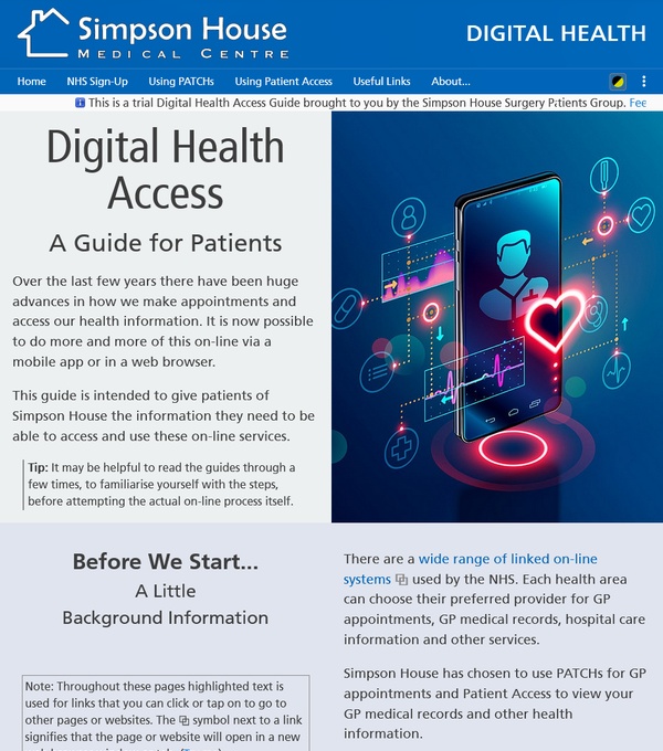
A WebShell site design for an online Digital Health Access Guide for patients.
Park Cafe Website
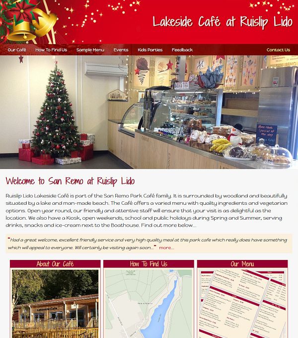
A Café WebShell site with calendar for automatic
seasonal branding.

Personal Training Site
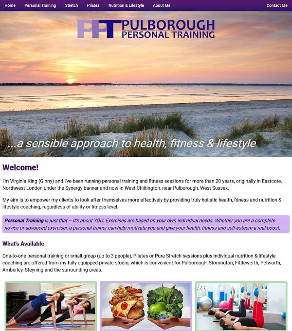
A Personal Training WebShell site with preloader and session bookings.
In Use
WebShell powered sites work just as well on mobile and tablet touch devices as they do on traditional desktop computers, so your visitors will just perceive a fast and professional website which looks great on whatever device they are using. This is especially important now as more than two-thirds of all website visits are done using mobile devices. Search engines such as Google and Bing now give priority to mobile-friendly sites in their search-result lists and visitors are now much less prepared to spend their time zooming and panning around outdated fixed-width desktop websites that don't provide a good mobile experience.
A poor user experience is the biggest single factor in making visitors leave a website early. WebShell gives you the opportunity to make the most of your website content - and at zero cost as part of one of our website design packages.
Find Out More
If you want to know more detail, then please take a look at the WebShell micro-site. If you want to do more and have your own professional web presence to showcase your business, but without the hassle of dealing with the 'techie' bits, then why not get in touch now.