
Framework
WebShell: The Flexible Site Framework
WebShell is a flexible, lightweight, responsive framework for building information portal websites and which works across all types of device from desktop PC's to smartphones. By automatically adjusting the page layout to suit the device display size, it always presents the optimum viewing experience.
Its modular structure is designed to be easily updateable to add functionality or refresh the appearance of a site without having to edit all the content. Regularly updated with new features and fully HTML5 compliant, it is the ideal solution for sole-trader and small business websites. Best of all, when taken as part of one of our web presence or design packages, it's completely free!
A Personal Training Site
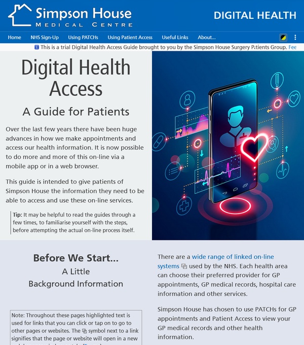
A GP Digital Health Guide WebShell site for patients needing help getting online access.
A Personal Training Site

A Personal Training website with session booking requests using WebShell.
A Crazy Golf Site
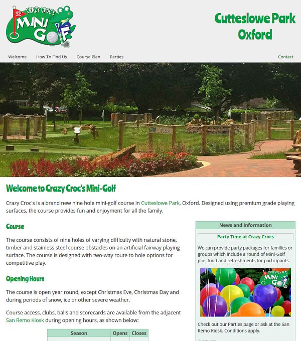
A Crazy Golf WebShell site with a simple clean look and rolling newsfeed.
Concept
Designing a website might sound easy and there are people (most of whom will be trying to persuade you to use their DIY web design tools to lock you into their service) who will try to convince you that it is. After all, putting a few images and some text on a page is not that much different from using a word-processor, surely?
In fact, building a website that looks professional, works well on different screen sizes and looks the same in all of the major web browsers is a more complicated task - and that is exactly what WebShell has been designed to help achieve with minimum effort and without the bloated code which many DIY web design systems produce.
WebShell is an in-house project, designed and built from the ground up to provide a responsive design framework that takes care of all the display size, page layout issues and more, providing consistent results across the major web browsers and screen sizes allowing the design effort to be concentrated on producing top quality content for the visitors to your new website.
Design Philosophy
Web browsers are supposed to respond to a standard set of webpage commands in a standard way, but there are still some differences in the way they work. Most of them are now based around one of three (what are known as) rendering engines; Blink, Webkit or Gecko. However, they still have their own oddities and quirks. The core functions of WebShell were designed to use a command set that is supported in a consistent way across all the major browsers.
Style sheets - files which allow layout, colours, fonts and styles to be specified without amending the individual page code - are also used, but again concentrating on the features that are supported in the same way by all the common browsers.
In order to achieve much of the additional functionality that WebShell provides, the system makes extensive use of scripts, but these are well supported by all modern browsers and the functions are grouped into library files which can be updated easily.
Some Feature Highlights
For display purposes, WebShell splits the page into Header, Menu, Content and Footer sections. On most websites, only the Content section tends to change between pages and so normally only this section is downloaded by WebShell when new pages are opened. This gives a better visual experience and saves both time and data - especially important when websites are viewed on mobiles with set data allowances and variable quality connections.
WebShell also offers a host of features, including a site preloader, image slide galleries, newsfeed, audio and video players, liquid/responsive page layout, auto-balancing columns, custom page tracking and many other features. It is also aware of Bank Holidays, Easter, Christmas and New Year periods and even when the clocks go forward and back. This allows for such things as conditional content or page decoration to suit the time of year, all of which can be set in advance to appear automatically as and when required. There is even a battery-saving 'dark-mode' option for mobiles with OLED displays or night-time use to reduce screen glare.
Unlike many systems, WebShell does all of this with only a small footprint and without requiring any additional services or installed software package add-ons at the webserver (many of which the hosting providers often charge for). This also means that you are not tied to one hosting provider and can easily move a site to almost any modern hosting service. WebShell even includes its own audit trail log which can be activated when testing to show what the system is doing as it runs.
WebShell does require some coding knowledge and so may not be for everyone, but contrast this with a popular DIY drag-and-drop web design package which produced bloated pages with code more than 15x larger than the similar WebShell version of the site! It also required specific services and code on the webserver.
Park Cafe Website
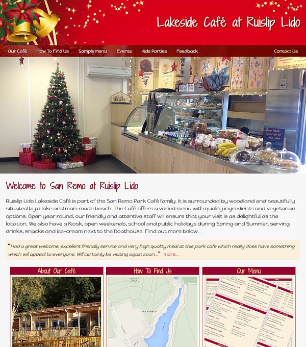
A Café WebShell site with calendar for automatic seasonal branding.

Building Contractor's Site
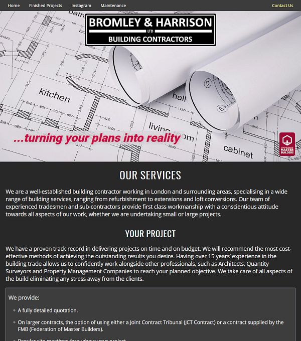
A building contractor's WebShell site, including
an Instagram widget.
Deep Cleaning Site

A cleaning
company WebShell site with scrolling offer info marquee.
In Use
WebShell powered sites work as well on mobile and touch devices as they do on traditional desktop computers. Visitors will just perceive a fast and professional website with a consistent look across the various display sizes, device types and major browser families. This is especially important as more than two-thirds of all website visits are now done using mobile devices, such as tablets and smartphones. Search engines such as Google and Bing now prioritise mobile-friendly sites in their search-result lists and visitors are now much less prepared to spend their time panning and zooming around fixed-width desktop websites that don't provide a good mobile experience.
It is worth noting that a poor user experience is the biggest single factor in making visitors leave a website early. WebShell gives you the opportunity to make the most of your website content - and at zero cost when part of one of our web presence or design packages.
In the spirit of 'eating your own dog food' (using your own product), this site was built using WebShell, including 'dark-mode' for mobile devices or low-light situations.
Next Steps
If you want to know more, then please take a look at the other pages on this site. If you want to do more and have your own professional web presence to showcase your business, but without the hassle of dealing with the 'techie' bits, then why not get in touch now to see what a WebShell based site could do for you.